There is a moment, somewhere in your fountain pen journey, when you look at the letters on the page and think: what if they could be even more beautiful? That is the moment calligraphy is waiting for you. And the best part is that you are probably closer to it than you think.
Calligraphy with a fountain pen is not the exclusive territory of professional artists or people with naturally elegant handwriting. It is a learnable skill, a patient practice, and for those who enjoy the rhythmic meditative quality of writing by hand, one of the most satisfying things you can do with an afternoon and an ink-filled pen.
What Is Fountain Pen Calligraphy?
Fountain pen calligraphy refers to the art of creating expressive, stylized lettering using a fountain pen, most often fitted with an italic or stub nib. Unlike traditional dip pen calligraphy, which requires a separate ink pot and delicate loading of the nib, fountain pen calligraphy is self-contained and far more forgiving for beginners.
Italic Nibs vs. Stub Nibs: What Is the Difference?
Both italic and stub nibs have a broad, flat writing surface that creates thick downstrokes and thin cross-strokes, the defining visual quality of calligraphy. The difference is in the edges. Italic nibs have sharper corners and produce crisper, more dramatic line variation. Stub nibs have slightly rounded corners, making them smoother and more forgiving if your pen angle drifts. For most beginners, a stub nib is the better starting point.
Recommended Pens for Your First Calligraphy Practice
You do not need to buy a specialized calligraphy pen. Many beginner-friendly fountain pens offer italic or stub nib options at very reasonable prices:
- LAMY Joy Calligraphy: Widely regarded as the go-to beginner calligraphy pen. Comes with 1.1mm, 1.5mm, and 1.9mm nibs, allowing you to explore different line widths.
- Pilot Parallel: Unique flat-edged nib that creates striking line variation. Its ink-mixing capability also opens creative possibilities for color blending.
- Kaweco Sport Calligraphy Set: Compact, high quality, and available in multiple nib sizes. A great option if you already own a Kaweco Sport and want to try calligraphy without buying a new pen body.
Why Calligraphy Is a Natural Next Step for Fountain Pen Writers
If you have already been writing with a fountain pen regularly, you have developed several habits that translate directly into calligraphy: a relaxed grip, light pressure, and an awareness of nib angle. These are the three pillars of calligraphic technique. You may be closer to elegant lettering than you realize.
Core Techniques: What to Focus on First
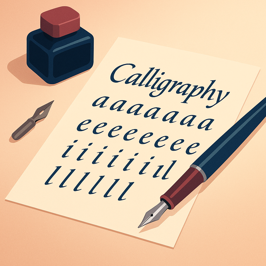
Before attempting full alphabets, spend time mastering the basic strokes that make up every calligraphic letter. These fundamentals will carry you through every style you encounter.
- Hold the pen at 45 degrees: This is the golden angle for italic calligraphy. Keeping the flat edge of the nib fully in contact with the paper at this angle produces the natural thick-thin contrast that defines the style.
- Let the nib width determine letter height: A useful rule: lowercase letters should be five nib-widths tall. Stack your pen horizontally, mark five nib-widths, and use that as your guideline height. Uppercase letters are typically seven nib-widths.
- Write with your arm, not your fingers: Guide the pen using the larger muscles of your forearm rather than gripping and steering with your fingers. This produces steadier, more consistent strokes and prevents hand fatigue.
- Practice downstrokes first: Fill a page with parallel vertical lines at your target angle. When those feel controlled and consistent, move to horizontal strokes, then diagonal, then simple letterforms like n, u, and o.
- Slow down deliberately: Calligraphy rewards patience. If your strokes feel scratchy or are skipping, the most likely solution is to slow your pace and lighten your pressure.
Paper and Ink Choices for Calligraphy Practice
Paper quality matters more in calligraphy than in everyday writing. The broad flat nib is in continuous contact with the paper surface, and rough or absorbent paper will cause ink to feather and edges to blur. Smooth cartridge paper, Rhodia pads, or Clairefontaine sheets all work beautifully. Avoid standard copier paper for anything you want to look its best.
For ink, start with a reliable, well-behaved black or dark blue. Once you have control over your letterforms, experimenting with colored inks adds a wonderful expressive dimension to your practice.
Pros and Cons of Learning Calligraphy with a Fountain Pen
No Separate Ink Loading Required
Unlike dip pens, a fountain pen carries its own ink supply, letting you focus entirely on letterforms without interrupting your flow to re-dip the nib.
More Forgiving for Beginners
Stub and italic nibs on fountain pens are more robust and consistent than flexible dip nibs, making the learning curve gentler and less frustrating.
Naturally Extends Your Existing Skills
If you already write with a fountain pen, you have most of the grip and pressure habits calligraphy requires already established.
Limited Line Variation Compared to Dip Pens
Fountain pen nibs produce consistent line width based on angle alone. For dramatic hairline-to-swell contrast, flexible dip pens still have the advantage.
Requires a Separate Calligraphy Nib
Your everyday fountain pen nib will not produce calligraphic line variation. You will need an italic or stub nib, either as a swap-out or on a second pen.
Frequently Asked Questions
Do I need to buy a new pen to try calligraphy?
Not necessarily. If you own a Lamy Safari or AL-Star, you can simply purchase a calligraphy nib in 1.1mm, 1.5mm, or 1.9mm and swap it in. The pen body stays the same. This is one of the most affordable ways to begin calligraphy practice.
How long before my calligraphy looks good?
With consistent daily practice of even fifteen minutes, most beginners produce recognizable, attractive letterforms within three to four weeks. The key word is consistent, because sporadic practice spreads that timeline significantly.
Should I learn a specific calligraphy style to start?
Italic calligraphy is the most natural starting point for fountain pen writers. Its letterforms are closely related to standard handwriting, and the pen angle requirements are clearly defined. Once you have italic under control, styles like Copperplate or Gothic become much more approachable.
Can I use my calligraphy pen for everyday writing too?
Yes, with some adjustment. A 1.1mm stub nib writes beautifully for everyday use and adds subtle line variation to ordinary handwriting without requiring a strict 45-degree angle. Many writers keep a stub nib pen as their primary everyday writer precisely because it elevates the look of their handwriting effortlessly.
Final Thoughts
Calligraphy is not a destination, it is a direction. Each practice session makes your eye sharper, your hand steadier, and your letters a little more your own. The fountain pen is a perfect companion for this kind of patient, pleasurable learning: it rewards a light touch, a steady pace, and the willingness to simply begin.
Pick up your pen. Draw a baseline. Write the letter n twenty times. You are already a calligrapher in training, and the practice is its own reward.