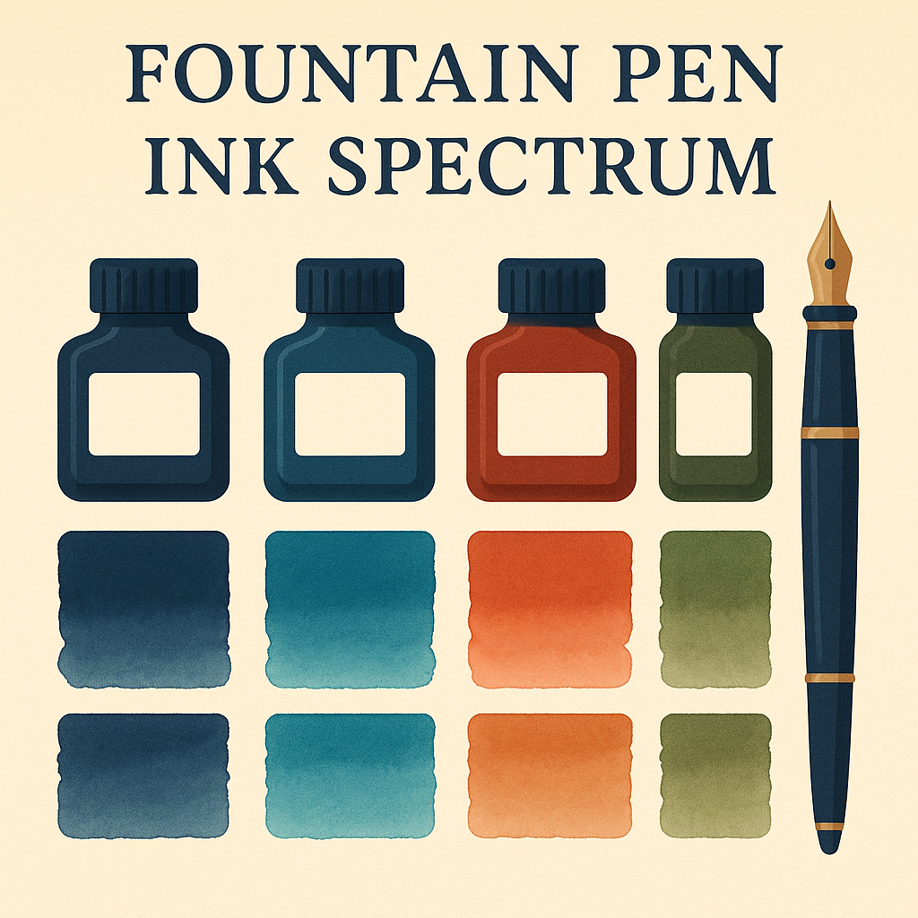
The world of fountain pen ink colors offers far more complexity and beauty than the simple black or blue inks most people remember from school. Each color brings its own personality to your writing, while different formulations create unique visual effects that can transform ordinary text into something extraordinary.
Think of fountain pen inks like an artist’s palette — each color tells a story, evokes emotions, and serves specific purposes. Understanding how different colors behave and what properties they possess helps you choose inks that not only look beautiful but also match your writing needs and personal style.
After decades of working with fountain pen enthusiasts, I’ve seen how the right color choice can reignite someone’s passion for handwriting. Let’s explore the fascinating world of ink colors and discover what makes each one special.
The Psychology of Color in Writing
Colors influence our emotions and perceptions more than we often realize. In handwriting, your ink color choice sends subtle messages about your personality and intentions, while also affecting how you feel about the writing process itself.
Classic Professional Colors
- Black: Authoritative, formal, timeless — perfect for important documents
- Blue: Trustworthy, approachable, versatile — ideal for daily correspondence
- Blue-Black: Professional yet distinctive — excellent for business writing
- Dark Green: Sophisticated, unique — great for editing and personal notes
These traditional colors remain popular because they work in virtually any situation while maintaining readability and professional appearance. However, the fountain pen world offers so much more for those ready to explore.
Understanding Ink Properties
Beyond color itself, fountain pen ink properties determine how your writing will look and behave on paper. These characteristics can dramatically affect the visual impact of your words.
🎨 Shading — The Artist’s Touch
Shading inks create natural variation from light to dark based on ink pooling. When you write slowly or use broader nibs, ink pools create darker areas, while quick strokes remain lighter. Waterman Serenity Blue demonstrates beautiful blue-to-navy shading that makes every word more interesting.
✨ Sheening — The Rainbow Effect
Sheening inks contain dyes that create metallic, rainbow-like reflections on paper. Diamine Oxblood, for example, shows deep red with green-gold sheen that shifts as you move the paper. This property works best with fountain pen-friendly papers that don’t absorb ink too quickly.
🌈 Chromatography — Hidden Colors
Some inks contain multiple dyes that separate slightly on paper, creating subtle color variations within a single stroke. These complex formulations add depth and character to your writing that simple single-dye inks cannot achieve.
Exploring the Color Spectrum
Each color family offers unique characteristics and emotional associations that can enhance different types of writing.
Blue Family — The Versatile Foundation
🔵 Royal Blue: Bold and confident, perfect for signatures and important correspondence. Pilot Iroshizuku Kon-peki exemplifies this category with stunning clarity and shading.
💙 Navy Blue: Sophisticated alternative to black with more character. Waterman Mysterious Blue offers rich, dark tones that remain professional while showing personality.
🌊 Turquoise: Creative and refreshing, ideal for personal journaling and artistic projects. Diamine Marine creates beautiful blue-green tones that capture ocean depths.
Warm Colors for Expression
Warm colors — reds, oranges, browns — bring energy and warmth to your writing while remaining surprisingly versatile for various applications.
Reds That Work
🍷 Burgundy/Wine: Sophisticated deep reds like Diamine Oxblood provide elegance without overwhelming brightness. Perfect for editing, special occasions, or adding warmth to personal correspondence.
🔴 Classic Red: Sheaffer Skrip Red delivers the fire-engine red that commands attention. Excellent for corrections, emphasis, or when you want your writing to make a statement.
🟤 Reddish-Brown: Diamine Ancient Copper bridges the gap between red and brown, offering earthiness with warmth. Ideal for autumn writing or when you want something unique yet readable.
Cool Colors for Calm
Cool colors — greens, purples, grays — create calming, sophisticated effects that can make writing feel more meditative and thoughtful.
Greens Beyond Basic
🟢 Forest Green: Rich, natural greens like Pilot Iroshizuku Shin-ryoku connect us to nature while maintaining professional appearance. Excellent for editing or adding variety to daily writing.
💚 Teal: Blue-green combinations offer the best of both worlds — professional enough for work, interesting enough for personal use. Diamine Teal creates beautiful color variations with fountain pen-friendly papers.
🟣 Purple Elegance: From soft lavenders to deep violets, purple inks add sophistication without being flashy. Waterman Tender Purple provides gentle elegance perfect for personal correspondence.
Pros and Cons
Personal Expression
Colors allow you to express personality and mood through your writing.
Visual Interest
Shading and sheening properties make every page more engaging.
Emotional Connection
Favorite colors can increase motivation to write more often.
Professional Limitations
Bright colors may not be appropriate for formal documents.
Readability Concerns
Light colors or unusual shades may be harder to read.
Paper Dependency
Special properties like sheening require fountain pen-friendly paper.
Universal Acceptance
Black and blue work in any professional or personal setting.
Maximum Readability
Dark colors provide excellent contrast on white paper.
Timeless Appeal
Classic colors never go out of style or appear dated.
Limited Expression
May feel boring or restrictive for creative writing.
Lacks Visual Interest
Plain colors don’t showcase fountain pen capabilities.
Missed Opportunities
Doesn’t take advantage of fountain pen color possibilities.
Choosing Colors for Different Purposes
The key to successful color selection lies in matching ink properties to your intended use. Different writing situations call for different color characteristics.
Professional Writing Palette
- Contracts and Forms: Black or blue-black for maximum authority
- Business Letters: Navy blue or dark blue-green for professionalism with character
- Editing and Review: Deep green or burgundy for clear distinction from original text
- Notes and Memos: Any color that maintains readability and reflects company culture
Paper and Color Interaction
The paper you choose dramatically affects how ink colors appear and behave. Understanding this relationship helps you get the most from your chosen colors.
📝 Fountain Pen Paper Benefits:
- Enhanced Shading: High-quality paper shows color variations more clearly
- Visible Sheening: Less absorbent surfaces allow metallic effects to develop
- True Colors: Proper paper prevents color distortion from excessive absorption
- Sharper Lines: Reduces feathering that can muddy color appearance
Premium papers like Rhodia, Clairefontaine, or Tomoe River transform the same ink into a completely different visual experience compared to standard copy paper.
Frequently Asked Questions
Do certain colors fade faster than others?
Yes, lighter colors and those with certain dye compositions may fade more quickly when exposed to sunlight. Blues and blacks typically offer the best longevity.
Can I mix different colored inks to create new colors?
While possible, mixing isn’t recommended for beginners as different ink formulations may not be chemically compatible. Consider buying pre-mixed colors instead.
Why do some colors look different in different pens?
Nib width, ink flow, and writing angle all affect color appearance. Broader nibs show more shading, while finer nibs produce more consistent color.
Are there colors I should avoid as a beginner?
Very light colors (pale yellow, light pink) can be hard to read, while some shimmer inks require more maintenance. Start with medium-toned colors for best results.
Final Thoughts
Understanding fountain pen ink colors and properties opens up a world of creative possibilities while helping you make informed choices for different writing situations. Each color brings its own character to your words, transforming the simple act of writing into a more personal and expressive experience.
Remember that color preference is deeply personal — what speaks to one person may not resonate with another. The beauty of fountain pen inks lies in this variety, offering something special for every taste, mood, and purpose. Start with colors that appeal to you emotionally, then gradually explore the technical properties that make each one unique.
Whether you prefer the timeless elegance of deep blues, the warm sophistication of burgundy, or the natural appeal of forest green, understanding how these colors behave helps you get the most from your fountain pen experience. Let your curiosity guide you as you discover the perfect colors to make your writing truly your own.